Categories
inspiration making

The collage illustrations of Dave McKean

Last week I began to draft a post about digital artist Dave McKean’s illustrations. I was planning to return to the half-written post when I got an email from Giles saying did I know that Dave McKean illustrated a piece of writing for COIL (the Journal of the Moving Image which Giles founded and edited) in the late 1990’s? Well, no, I didn’t. But now I do, this makes a perfect focus for writing about his work. All images below are from The Entrapment from COIL 7 | 1998. Thanks for the tip Giles!

Since 1994 Dave McKean’s been producing extensively layered images using computers and digital manipulation. In his collaborations with writers, illustrations and text appear to be intertwined so that the paper becomes part of the content and I was interested to find out how he achieves this effect.  In an interview on Apple’s website he describes how his approach has changed with the increasing sophistication of digital technologies.

“The major things that have changed … are the tools and materials I’ve been able to use. When I started on ‘The Sandman,’ I was aiming toward a translucent collage, a layered look, an insubstantial feeling where you’ve just got an atmosphere. I tried to do that with things like double exposures and different printing techniques. To a degree, this approach is always pretty limited by the fact that the illustration has to be a physical object and, if I have to photograph it, limited by gravity.”


The illustrations for COIL were made in 1998 (COIL 7) for a supposedly ‘anonymous’ piece actually written by legendary indie producer Keith Griffiths (of Koninck fame) about a film he produced by Iain Sinclair & Chris Petit called the Falconer – itself about another ‘legendary’ 60s filmmaker called Peter Whitehead. Its a many-layered piece about becoming trapped in the layers of legend and hype spun around Whitehead and the narrator’s (“Darke”) attempt to unravel the story. Darke is a thinly veiled characterisation of the Falconer’s script writer (and 90s film critic) Chris Darke. The techniques of double exposure and layering that Dave McKean mentions in the interview with Apple are clearly visible in the collages of text and images he produced for this.

The process of creating these illustration begins with “endless drawings.” Out of these, one is chosen and painted onto a backboard of colour photographs and paper collages, a basic canvas already with a life to it, containing interesting textures, colours and shapes. Illustration comes next where McKean paints the characters onto the canvas. From here, the process moves onto the computer. “Sometimes I finish it [the painting] quite well and sometimes I leave it open and rough, scan it and make sense of it in the computer. The compositing is the fun bit, really, and dragging all these elements together all happens very quickly.” As McKean writes, it’s an explorative way of working, “I like the fact that I don’t really know what I’m aiming toward completely. I have an idea, but it’s also the shapes shifted and composited in the computer that allow me to find a nice blend.”


In fact, it seems that his process and approach has remained surprisingly constant as tools and materials have evolved. In this article, he suggests this goes back to his college days at Berkshire College of Art and Design, “Before drawing anything we had to have a clear idea of what we were trying to achieve. So to this day, I still write personal briefs for myself. I still need to be clear in my own mind what I’m doing.”

For me, what is so inspiring about this description of the process is that having a clear plan from the outset in no way constrains the experimental, organic nature of the final illustrations. As he writes, “Techniques may change and go in and out of fashion, but ideas are always worth exploring and re-interpreting.” I wonder if we could get him to design an eBook…

Categories
making

How to keep a geological field notebook


A very tangible field notebook (via fieldnotebookcom)

Following on from the paper versus digital notebook conversation the other day I came across this post describing how to keep a geological field notebook. What I liked was how few of the characteristics and possible uses of a geologists field notebook they list actually have to do with the content and how many are to do with the form!

“A well-kept field notebook can function not only as a recording device in the field, but as a scale for photographs, an umbrella, a signal, and most importantly, as a guidebook for the next time one is schlepping through the same area. The notebook itself should be small and easy to carry, and preferably a bright colour, making it hard to lose. It should be bound so the pages will not fall out, and have a hard cover, so that one can write in it easily. Also, because geologists work in all sorts of weather and locations, the notebook should be waterproof, with synthetic or coated paper on which pencil marks will remain legible when wet.”


A field notebook being used to show the scale of a mineralised water droplet (via www.uwec.edu);

The author then describes the type of content you might want to include in your geological notebook and formats you might want to use (and very sensible advice it seems too) Of more interest to me though is the discussion that followed on from this post where the first person asked “can one not have a digital note book ?”and was told that while you could have a digital notebook..

“your trusty notebook cannot get a virus, cannot crash or freeze, will not run out of batteries, is generally impervious to moisture (see bit in the entry about using pencil – though biro isn’t bad), does not require backups or upgrades (other than a new one once that one is full) is easily archived and retrieved, can be used as a fly swat, impromtu dinner plate, signalling device, flat plane for getting an average dip using the compass-clino, scale in photographs… oh, and it doesn’t break when put in rucksack or pockets along with rocks, hammers, tape measures, lunch etc…”

Which I think pretty much covers all of the ways in which paper notebooks can be used – though of course computer notebooks can do some of these tasks too. (And the authors did say that digital notebooks do have their advantages to geologists such as GPS and GIS.) Now I’m going to go away and think about how I can make a bookleteer eBook that can function as a signalling device, dinner place, fly swat and umbrella..


A notebook being used as a plate (via www.seriouseats.com)

p.s. I have to admit, partly I wanted to write about this post because it begins with this sentence.. “A geologist’s field notebook is analogous to the hitch-hiker’s towel – it is indispensable.”

Categories
inspiration making sharing

Art Space Tokyo: Shared Making

Art Space Tokyo is an intimate guide to the Tokyo art world by Ashley Rawlings and Craig Mod and a very beautiful book describing the buildings and neighbourhoods of 12 distinctive Tokyo galleries. There are maps for each of the areas, illustrations of the galleries by Nobumasa Takahashi  (the cover is a composite map of Tokyo by Craig Mod) alongside interviews and essays.


Inside pages from Art Space Tokyo

In the Preface to Art Space Tokyo Ashley and Craig write:

“We believe that art is not just an end goal, but a process involving all manner of people. Aside from the artists themselves, the art world is made up of collectors, curators, architects, businessmen, npo organizations and the patrons — those of us who gain pleasure from simply viewing and interacting with art — all taking part in some way to foster the creation and consumption process.”

Although here they were referring to the people who work in and with galleries and art they also applied this philosophy to the creation of Art Space Tokyo. Originally printed in 2008 the book was sold out by Spring 2009. In 2010 Ashley and Craig decided that they would like to update and reprint the book as well as create a free web edition for the iPad extending the original concept with videos of the spaces and interviews with local characters, sound-recordings that reveal the ambience of the neighbourhoods and rich interactive maps.


Illustration for GA Gallery, Yoyogi / Harajuku

In the spirit of shared making, it was at this point that they turned to Kickstarter as a way to raise the money necessary to achieve their goal. Kickstarter allows people to advertise their project and ask for contributions towards realising it. Requested contributions for any project range from a few dollars to a few thousand dollars – with your reward increasing alongside your contribution. For example, a pledge of $25 Art Space Tokyo would have got you a PDF of the book plus access to all project updates. At the other end of the scale for a pledge of $2500 you would have received all of the rewards of the other pledge amounts (e.g. copy of the book, original artwork) plus a 1-day tour of the art spaces of Tokyo with Craig Mod.

Is this shared making? Well, yes, I think it is.. As they write in the preface art – or making – is a process not just a product and through Kickstarter Ashley and Craig were offering the opportunity to become part of this process. And I hope the benefits were mutual – they got to reprint the book, contributors got a tangible reward (and presumably a warm fuzzy feeling from helping out two artists).

p.s. If you were thinking of contributing you’re too late… Ashley and Craig wanted $15,000. By 1 May when the pledges closed they had 265 backers and had raised $23,790!

Categories
inspiration

How can you have a pop-up book on the iPad?

This was the question I typed into Google as I wondered how the iPad, Kindle and other eBook readers (or rather, developers of eBooks for these platforms) might accommodate the tangible properties of books such as size, paper type, pop-up illustrations and so on, that vary from book to book and make paper books such a pleasure to touch, hold and feel.

In answer to my question Google came up with a couple of examples of projects that claim to be bringing pop-up books to the iPad. The first is Pilgrim’s Progress by Tako Games. Although entirely computer-generated the video that accompanies this eBook suggests that Pilgrim’s Progress combines moving around a 3-dimensional scene that closely resembles a paper pop-up book (the ‘cover’ of the book is a very literal digitisation of an antique leather book) with some dynamic elements such as changing text within the text box. I found it difficult to tell from the video how much of this would be controlled by the reader.

The second suggestion by Google was Alice in Wonderland by AtomicAntelope. While clearly drawing on pop-up books for inspiration this feels like it is also pushing the format into new areas by exploiting the touchscreen to trigger events and, quite beautifully, using the built-in accelerometer and orientation sensors to control visual effects such as flying cards, Alice growing and shrinking and rocking the pigbaby to sleep.

While I have to confess that watching the Alice in Wonderland video made me wish I owned an iPad so I could play with this, I also wonder – if every book feels like an electronic device then, however visually compelling the eBook, won’t this somehow feel like a sensory reduction of the reading experience?

Categories
inspiration

If you want to continue reading, scroll down

I’m not sure if Choose Your Own Adventure books count as shared making or shared reading (or both?) but I would certainly claim it as an augmented reading experience. The Choose Your Own Adventure series of children’s books was published by Bantam books between 1979 and 1998, however, the format was used for several other series of books including Fighting Fantasy (which was the Choose Your Own Adventure books of choice for my brother and I when we were kids).


Genuine Choose Your Own Adventure book covers from a fabulous collection at superduper.shapesofsweetness.com

In case you’ve never come across them, the premise is that you – the reader – take the role of protagonist in the books and at the end of each short section of narrative you are presented with a number of options representing your next actions. For example, in The Cave of Time, the first choice you are required to make is:

If you decide to start back home, turn to page 4.
If you decide to wait, turn to page 5.

Turning to the page for your chosen option the narrative continues, eventually leading to one of multiple different endings. Like I said, my brother and I read these a lot as kids and while the narratives tend to be quite similar and the range of options can be frustrating (“But why can’t I throw my frying pan at the King of the Ants?!”) they were also truly engaging as we tried to figure out the potential consequences of our actions.


More from superduper.shapesofsweetness.com

Of course, the branching structure and constrained options translate easily into computer programs and computer games might be seen as the multimedia, all-bells-and-whistles version of Choose Your Own Adventure. In my current reflection on the nature of books though I begin to wonder if the format of these books creates a different experience for maker/readers? For my brother and I these books were very definitely a collaborative experience – just as computer games can be – but they are also slower paced and with the opportunity to take a sneaky look ahead and see what happens if you choose a particular path. While I wouldn’t say that Choose Your Own Adventure books are more engaging than computer games (we gave them up around the time we got our first computer..) I think they might offer a unique type of reading – constructive, collaborative and accountable.

Categories
examples inspiration making

James Bridle: Bookcubes and bookleteer API


A set of Bookcubes generated using the bookleteer API

James Bridle of booktwo.org was one of the participants at the Pitch Up and Publish: Augmented Reading a couple of weeks ago, and he talked a little about the idea of books as symbols and the related BookCube project he’d done using the bookleteer API.

Here, I’ll just give a summary of the project. James has written a post on booktwo.org describing the project which I really recommend you to read because it’s seriously interesting and covers more topics than I describe here…

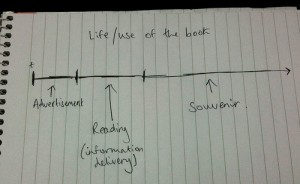
James started with the idea that the lifespan of a book looks something like the drawing in the image above. There is a short period of the book-as-object acting as it’s own advertisement, then a period of time where you are reading the book and taking in the content, then during the final, and longest, amount of time the book-as-object acts as a souvenir of the reading period.

James has already begun to address the idea of digital souvenirs for eBooks with his bkkeepr project and with the bookleteer API he extended this to create automatically generated Bookcubes. These cubes display the information collected by bkkeepr and includes an image of the book cover. Over time James imagines the Bookcubes to build up on your shelf as a visible and tangible souvenir of your eBook reading. For bookleteer, this is an interesting tangent – instead of being an object to read it becomes an object that marks the fact that reading has taken place – and the content becomes separated from the form.

Categories
inspiration making

Shared making of the Oxford English Dictionary

Yesterday I wrote about Storybird and how it enables a form of shared making through an online interface using email to notify authors when it is their turn. This reminded me of a very definitely non-technological example of the shared making of books..


Making the Oxford English Dictionary

From when the gargantuan project of compiling the Oxford English Dictionary began in 1857 it would take 71 years until the first edition was published. The third editor, James Murray, worked on the project for 36 years but died before he saw it completed. As part of his tasks Murray oversaw hundreds of volunteer readers and contributors who would painstakingly search out early examples of the use of words and send them to Murray by post. As a result of this mail-enabled shared making method, the first Oxford English Dictionary contained 414,825 words, and 1,827,306 illustrative quotations.

Contributors were not all academics and linguists. J.R.R. Tolkein was a volunteer while one of the most notorious, and prolific, contributors was Dr W. C. Minor, a murderer and certified inmate of Broadmoor Criminal Lunatic Asylum. Confined at Broadmoor with his collection of rare books, Minor happened upon Murray’s call for ‘men of letters’ to become Oxford English Dictionary volunteers in the early 1880s and began scouring his collection for the first or best uses of words.

If the project took place today it would almost certainly be termed a ‘crowd-sourcing’ project and would be built as a wiki (see en.wiktionary.org/wiki/). What does this non-digital shared making project suggest? That times change, technologies move on but ideas remain the same, or perhaps that we shouldn’t let technology get in the way of carrying out a good idea..?

Categories
inspiration

Storybird – collaborative storytelling

Storybird is a website where you can create your own online illustrated storybook. Aimed at children from 3 – 13 books can be created collaboratively and they positively encourage families, friends and school classes to work together. The artwork for your stories is provided by illustators and visual artists who are able to upload their drawings to the site. Making a Storybird is free though they plan to charge for their printing service when it starts later this year. You can browse by artwork or themes as inspiration to start your book and I have to say I like the look of the site and the illustrations very much.

When collaborating on a Storybird each person can jump in and make changes any time they like, however, they have also put together a more formal collaboration process based on turn-taking. One person starts the Storybird and when they want to pass over to their friend they let Storybird know and an email will be sent to their friend telling them it is now their turn. Storybirds can be kept private or published to the library when complete so that other people can share it too.

As I said, I love the look of the site and the illustrations they currently have in the library. It seems it would be difficult not to create a visually beautiful book from these pictures – and I imagine you can upload your own artwork if you want to illustrate your own stories. Storybird suggests that contributing artwork to Storybird has several benefits for artists including making money from your work. However, I’m unclear how this happens when making a Storybird is free… (If you find out please do let me know!)

How does this relate to bookleteer eBooks? I think it’s interesting that the Storybird exists only as an electronic online storybook (at least for the moment) and I don’t find that this detracts from the reading experience – though perhaps I’d feel differently about this if I was reading with a child, or group of children. On the other hand I can also imagine that if I was a child and had created my own Storybird that I would love to see it printed out as a proper little book that I could take home and show my family and friends. I wonder what it is about tangible, hold-able items that makes them feel so personal and intimate compared to things on a screen?

Categories
inspiration

Sneaky Peek at Alice’s Desk

While Alice was out getting lunch I took some sneaky photos of the 3-dimensional illustrations she’s been working on. The drawings for these come from the ones made in Brixton and Coventry for the Empty Shops Network tour. Parts of them have then been cut out, folded and re-attached to give a diorama feel.

I’d love to see my pop-up eBook experiments and Alice’s drawings come together some day to create a colourful hand-drawn eBook pop-up extravaganza.

Categories
inspiration

Alice Angus: 12 Month Schedule

This 12 Month Schedule by Alice is my new favourite eBook. It has one month per page with pages for notes  and every page is decorated with illustrations by Alice. It’s designed as a notebook to carry around and use as a way to keep yourself organised, jot down ideas or make sketches. But seriously, could you bring yourself to write on top of Alice’s amazing drawings??

Cover image (from In Good Heart series)

The Schedule eBook can be downloaded at diffusion.org.uk. And if you have access to an A3 printer then you are even luckier because you can make it up at the new A5 size and enjoy the illustrations at twice the size (or have twice the room for making notes..).

If you want to see more detail of the pictures check out Alice’s Flickr stream.